
Advanced grids
Advanced grids are programmable, reusable overlays for Android. Create and validate them in the Grids tab, then toggle the enabled grid from the Clash Caddie overlay.
Advanced grids use a Material Que-compatible line syntax with Clash Caddie label extensions.
Using Advanced Grids
- Open the app's grid settings screen.
- Purchase or restore Advanced Grids if the feature is locked.
- Use the grid actions menu to create, rename, delete, import, export, convert, or reset saved grids.
- Edit the grid code in the editor.
- Enable the saved grid you want to render.
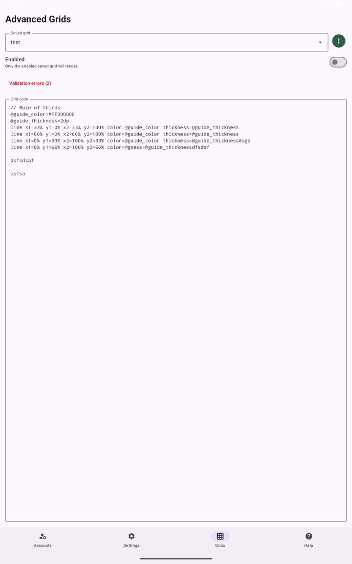
Advanced grid files are plain text. Import and export use the syntax shown below.
Basics
Each non-comment line is either a variable, an inset, or a drawing command.
// Center pull line
@line_color=black
@line_width=1dp
inset top=-500 bottom=0 left=50%
keyline distance=0 from=left outside color=@line_color thickness=@line_width
Use // for comments.
Variables
Variables start with @ and can be used in later lines.
@dial_color=white
@dial_thickness=1dp
keyline distance=0 from=bottom color=@dial_color thickness=@dial_thickness
Special defaults:
@keyline_colorsets the default keyline color.@keyline_thicknesssets the default keyline thickness.
Values
Supported units:
50%
20dp
18sp
100px
100
-25dp
.25dp
Percent values are relative to the overlay width or height. Numbers without a unit are treated as raw pixels.
Colors can be Android hex colors or common names:
black
white
red
green
blue
yellow
cyan
magenta
transparent
#FFFFFFFF
#80FFFFFF
#00000000
Insets
inset sets the drawing area for following Material Que commands.
inset top=10dp left=5% right=5%
inset left=6 top=300 width=220 height=220
Supported inset parameters:
topbottomleftrightwidthheight
Keylines
keyline draws one vertical or horizontal line inside the current inset.
inset left=50%
keyline distance=0 from=left color=black thickness=1dp outside

inset top=50dp left=600dp right=115dp
keyline distance=40dp from=top color=white thickness=1dp text="40" label-side=left text-colour=yellow text-size=12sp
Parameters:
distance: offset from the chosen edge.from:left,right,top, orbottom.color: line color.thickness: line width.outside: optional flag that draws on the inset edge.text: optional label text. Quote text that contains spaces.text-size: optional label size.text-sideorlabel-side: optional label side on the drawn line segment. For horizontal lines,leftandrightplace text at the line ends whiletopandbottomplace text above or below the line. For vertical lines,topandbottomplace text at the line ends whileleftandrightplace text beside the line.text-colorortext-colour: optional label color.
Grid Lines
grid-lines draws repeated keylines from the current inset.
inset top=50dp left=600dp right=115dp
grid-lines step=5dp from=top limit=100 color=white thickness=1dp

inset top=50dp left=600dp right=115dp
grid-lines step=10dp from=top limit=11 color=white thickness=1dp label-start=0 label-step=10 label-side=left text-colour=yellow text-size=12sp

inset top=100dp left=550dp right=75dp
grid-lines step=50dp from=top limit=8 distance=80dp color=black tick-color=#808080 thickness=.25dp
Parameters:
step: distance between generated lines.from:left,right,top, orbottom.limit: number of generated lines.distance: optional major mark length. When omitted, generated lines span the full current inset. When present, generated lines become ruler-style marks and 9 in-between ticks are drawn between each pair of major step lines.color: line color.tick-colorortick-colour: optional color for in-between ticks. Defaults to the generated linecolor.thickness: line width.outside: optional flag.text: optional label text repeated on every generated line.label-start: optional first generated numeric label.label-step: optional amount added to the label for each generated line.text-size: optional label size.text-sideorlabel-side: optional label side on the drawn line segment. For horizontal lines,leftandrightplace text at the line ends whiletopandbottomplace text above or below the line. For vertical lines,topandbottomplace text at the line ends whileleftandrightplace text beside the line. Whendistanceis used, ruler marks align to the opposite side:label-side=rightaligns marks left,label-side=leftaligns marks right,label-side=topaligns marks bottom, andlabel-side=bottomaligns marks top.text-colorortext-colour: optional label color.
With distance, major marks use the provided length. The in-between ticks at 10%, 20%, 30%, 40%, 60%, 70%, 80%, and 90% use half that length, while the halfway tick at 50% uses three-quarter length. For example, step=50dp limit=8 distance=80dp draws 8 major marks spaced every 50dp, plus 9 ticks between adjacent major marks. Most in-between ticks are 40dp long and the halfway tick is 60dp long.
Lines
Clash Caddie adds a Material Que-like line command for direct point-to-point lines.
line x1=0% y1=50% x2=100% y2=50% color=white thickness=1dp
Parameters:
x1,y1: start point.x2,y2: end point.color: line color.thickness: line width.
Circles
circle center-x=50% center-y=50% radius=20% color=cyan thickness=3dp fill=#00000000
Aliases:
centerX,cx, orxforcenter-x.centerY,cy, oryforcenter-y.rforradius.
Rectangles
rectangle left=10% top=10% width=80% height=80% color=white thickness=2dp fill=#20000000
Aliases:
rectforrectangle.xforleft.yfortop.wforwidth.hforheight.
Text
text left=50% top=50% value="Center" text-color=white text-size=18sp
label left=63% top=50% value=2 text-color=yellow
Aliases:
labelfortext.xforleft.yfortop.textforvalue.
Text coordinates use Android canvas text positioning: left is where the text begins and top is the text baseline.
Fonts
Use font-family to select the Android typeface used for standalone text and labels. The most portable choices are:
sans-serif: Android's default user-interface font.serif: Android's default serif font.monospace: Android's default fixed-width font.
Android devices commonly also provide these families:
sans-serif-thinsans-serif-lightsans-serif-mediumsans-serif-blacksans-serif-condensedsans-serif-condensed-lightsans-serif-condensed-mediumsans-serif-smallcapscasualcursive
Set the family on standalone text:
text left=50% top=50% value="Center" text-color=white text-size=18sp font-family=monospace
It can also be applied to a keyline label:
keyline distance=40dp from=top text="40" label-side=left text-color=yellow text-size=12sp font-family=sans-serif-condensed
Or to labels generated by grid-lines:
grid-lines step=10dp from=top limit=11 label-start=0 label-step=10 label-side=left text-color=yellow text-size=12sp font-family=serif
Quote a family name if it contains spaces:
text left=10dp top=20dp value="Example" font-family="Some Font Name"
Font availability can vary between Android devices. If a requested family is unavailable, Android silently substitutes a fallback font. For consistent results across devices, prefer sans-serif, serif, or monospace.
Advanced grids cannot load custom .ttf or .otf files. Font weight and italic style also cannot be selected separately; text is requested using the chosen family's normal style.
Shared Style Parameters
Most drawing commands accept these optional parameters:
colorfillthicknesstext-colortext-colourtext-sizefont-familyalpharotationvisiblelayer
Variables are the recommended way to share style across multiple lines.
Migration
Old block-style grids are no longer converted or rendered; new grids, reset grids, imports, and exports should use the Material Que-compatible syntax.
ratio-keyline is no longer supported. Use keyline ... text=... to attach text to a line or text/label for free-positioned text.
Examples
Rule Of Thirds
@guide_color=#FF000000
@guide_thickness=2dp
line x1=33% y1=0% x2=33% y2=100% color=@guide_color thickness=@guide_thickness
line x1=66% y1=0% x2=66% y2=100% color=@guide_color thickness=@guide_thickness
line x1=0% y1=33% x2=100% y2=33% color=@guide_color thickness=@guide_thickness
line x1=0% y1=66% x2=100% y2=66% color=@guide_color thickness=@guide_thickness
Slider Ruler
inset top=50dp left=600dp right=115dp
grid-lines step=5dp from=top limit=100 color=white thickness=1dp label-start=0 label-step=5 label-side=left text-colour=yellow text-size=12sp

inset top=100dp left=550dp right=75dp
grid-lines step=50dp from=top limit=8 color=black thickness=.25dp
Numbered Aim Guide
@ring_color=#FFFFFFFF
@label_color=#FFFFFF00
circle center-x=50% center-y=50% radius=12% color=@ring_color thickness=2dp fill=#00000000
circle center-x=50% center-y=50% radius=24% color=@ring_color thickness=2dp fill=#00000000
text left=53% top=50% value=1 text-color=@label_color text-size=18sp
text left=63% top=50% value=2 text-color=@label_color text-size=18sp
Validation Notes
The editor validates grid code as you type. Unknown commands, missing required arguments, and malformed numeric values are reported with line and column information.
Common issues:
- Use
name=valuefor parameters. - Quote text that contains spaces.
- Define variables before using them.
frommust beleft,right,top, orbottom.grid-linesneeds a non-negativelimit.